Introduction
This post describes the first iteration of our digital prototype. Although it is quite static and only covers certain action, it shows quite reliably what the final application will look like an gives a realistic idea about its functionality. First we'll describe our method, set-up and test subjects. The method and set-up are almost exactly the same as the previous iteration.Next, we describe the results of this iteration, both evaluating the changes made last time and addressing new problems we met. Finally, we look ahead to the next iteration.
1. Method and set-up
As said, our method is almost the same as the previous iteration. We still conduct user interviews with a specific set of tasks. For convenience, these tasks are listed here once more (with only minor differences compared to the previous set).- Move CLIP 2 to tomorrow at work
- Move the MAIL and CLIP 3 to Monday next week before bed
- Move CLIP 1 to Monday in 2 weeks
- Move the tweet to the personal archive map
- Check the messages for today at work
- Show no more Youtube messages
- Show all messages from all sources again
- Remove CLIP 5
- Open the mail from Lieven
- Close the mail
- Prioritize CLIP 4 to level 1
- Search for the term “lieven”
- Find two messages you failed to read yesterday
- Show all messages again
- Log out
As a second part, we have our CSUQ based questionnaire. It contains only the questions about usefulness and user-friendliness because we wanted to focus on these aspects and not bother the user with the entire questionnaire. Although again, our number of test subjects is limited - thus statistically insignificant - we wanted to include it to allow for comparison with the previous questionnaire. To finish, we included some design questions and the possibility to offer free comments. The design questions were as follows:
- The need for ‘help’ functionality - would it be used at all?
- Are the source selection process and the icons clear
- Is the new positioning of the category labels handy?
- Are some labels used more often, should they be bigger?
- Is the number and of time categories large enough
- Reception of the changes to the search functionality
- Where am I? Can you easily find what messages you're looking at?
Our prototype is shown in the picture below.

2. Test subjects
As with the previous test, we validated our design with 4 users. All of them were engineering students. There are several reasons for this. First of all, they're easy to reach, since we are students ourselves. Yet, they are also likely to be representative to our target audience or might evolve so in the feature. They are familiar with web tools and would be expected to use several streams and deal with a fairly large amount of digital information frequently. Yet, the general questions we asked lead to rather contrary conclusions. The students used mail, Facebook, Toledo and sometimes some news feeds as well. Yet, they didn't complain about information overload. It's indeed a very specific audience we're trying to reach here. Still, we consider them representative because their situation allows them to imagine (and sometimes, to a lesser extent experience) the problem.3. Analysis and results
Firstly, we'll look back on the changes and problems that came out of the previous iteration. Secondly, we'll discuss new problems that arose in this iteration. We end by discussing the questionnaire.3.1 Review on the changes from previous iteration
Dropping the calendar iconsBecause the users indicated they weren't really necessary, we dropped the icons by the time categories. As it happens, no one had any problem to find the right (kind of) category right away. We therefore stick to our decision of removing them in the digital prototype.
Irrelevance of the tabbing system
We replaced the 'New' and 'ToDo' tab by a 'New' label. The ToDo tab was never used and the behaviour of the category labels actually didn't require a second mode. All users never experienced any difficulties in finding their way in the new design. This is certainly and improvement compared to the remarks we got on the lack of clarity in the tabbed design.
The new time categories
The questionnaire at the end of the interview explicitly asked whether the number and granularity of the time categories were sufficient. Opinions among the test users were divided. All of them found the correct categories when performing a task, but three out of four expressed concerns. Mostly, these were rather personal. If one intends to use it mostly for organising one's job, 'Saturday' and 'Sunday' could be replaced by 'Weekend'. Someone even suggested a category named 'If I ever have time'. Another concern was the usefulness of 'Spam'. One user thought it the concern of the feed sources to filter (e.g. blacklist in mailbox). A solution to this diversity of uses is to make the categories configurable to the user.
One specific concern reappeared. Although the increased number of categories and the longer spread in time diminish the effect, the messages still return to the 'New' queue after a while, forcing the user to sort them again. For example, if one files a message for next week, it will reappear in the stream exactly one week later. We decided the application would work this way in the previous iterations and couldn't come up with an elegant idea to deal with a widening granularity in any other way.
The 'Missed' category
The category contains the messages users failed to read on the intended day. Of course, this only works for coming week. Other messages return to the stream. We'll assume people follow the 'zero inbox' ideal to circumvent this. When prompted to look for messages the might have forgotten, all users immediately knew where to look.
Source selection
In order to make clear what sources were involved, we included the same icons with the source selection as the one we used on the messages. Although last time, some users complained about the tediousness of selecting only a single source - requiring two clicks instead of one - all users found a solution, as did the users in the previous iteration anyway. The additional option of double clicking was never used, since, as we mentioned last time, it is rather uncommon.
Adaptations in the search panel
We changed the 'Scope' label caption to 'Search in'. Now, no one was mistaken about its meaning. Yet, additional problems arose, as explained in the next section.
The 'Clear search' button we included was not deemed very useful. People would rather have a cross-icon or clear the search field to obtain the required result.
Where am I?
To make clear what messages were being viewed, we highlighted the corresponding label. This was a clear indication of the selected category, all agreed upon. The subcategory was added in a smaller fond. When we asked the subjects about it, they found it, but told us they only realised it because we asked. It should therefore be larger or in bold. In a next iteration, we plan to include breadcrumbs to tackle this issue as well.
Reorganizing the labels
The new labels form an L-shape. Although no-one failed to find any of them, we got some remarks. It should be better to put the 'Trash' in the rightmost spot. Spam was considered to draw too much attention. Otherwise, the reactions were positive: the layout got good remarks.
4.2 New problems and solutions
Some minor issues and observationsWe noticed that none of the users ever attempted to move the messages by clicking the labels. They always used the dragging instead. This reinforces us in our belief that this is the most productive way and explains the effort we put into this mechanism both in the prototype and the ongoing implementation.
The label for search displays a pair of binoculars. Although this is not uncommon, people preferred the loupe instead, which is the standard in web applications.
Someone remarked the Archive might grow wild after a lot of time, making at impossible to display it compactly as a dropdown menu from its label. We won't go into that, but only remark that it would be possible to show the most used folders first, as happens in mail clients.
Actually, the functioning of the dropdown menus itself was not entirely clear. When we asked to file a message for tommorow - at work, users had to look for a while. Once they hovered over a category, the understood. This doesn't pose any real problem.
Highest priority
Asking the users to assign a message the hightest priority, they were confronted with a choice between 'priority 1', 'priority 2' and 'priority 3'. Which one is the highest: 1 or 3? To solve this, we'll replace the labels with 'High', 'Normal' and 'Low Priority'.
Recovery from error
When one user asked whether he could restore messages from the trash can, he got us thinking. People do make mistakes. A good design should acknowledge this and offer a simple way to limit the damage or solve any problem. We will include an 'Undo' button for this reason.
Shortcuts
As the application tries to focus on effectively and efficiently dealing with informations, shortcuts should not be neglected. For example, people tend to use 'Enter' when starting the search or 'Delete' to remove a selected message. We'll incorporate these two examples in the next iteration.
Read messages
When messages have been read, they don't disappear (as one user thought would be better), but change colour to indicate its status. We already decided this during the paper prototyping phase, but overlooked it so far in the digital one. It will be changed.
Advanced search revisited
The advanced search panel was rather confusing. It was shown automatically with every search action. Users wondered whether they should press search again (despite having already done so in the main screen). We thus decided to show it only when explicitly required.
Although the 'Search in' is a much cleared description than 'Scope', other problems remain in this panel, which is shown below in its context.
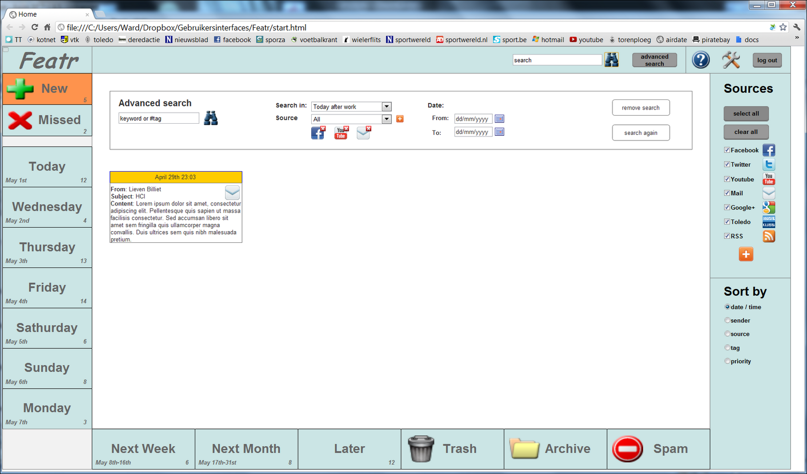
The scope should be extended to cover both the category (e.g. Sunday) and the subcategory (e.g. At Home). To this end, a second dropdown list will present these subcategories. Both category and subcategory list contain an 'All' entry.
Selection of sources was not very easy: one had to select a source from the dropdown list and click the '+' sign to add it. The corresponding icon would appear below. To remove a source, one should click the x at the topright corner of the icon. We decided to do away with this selection entirely, using the right panel (for sources) as an alternative. Although one could conclude that the same solution could be applied to the left pane for selecting the scope, this is not the case. Although the currently selected category initializes the values for the advances search, it is for example impossible to select all categories at once, whereas this can be done for the sources.
4.3 Questionnaire
The results of the CSUQ part of the questionnaire are presented below.
The first question shows the user is quite certain about the capabilities of the application, the mean of 5.5 being significantly larger than a mediocre value.
The second question scores higher now than it the previous iteration (it was coded 6646). This is no surprise, since the system seems more real and less tedious in a digital version.
The organization of information is not perceived as bad, but still, the result is lower than last iteration (coded 4666). This might be due to the spread of the categories over two sides of the screen, which is more complex.
Here, the same reasoning as in question two applies: a digital prototype is perceived as more pleasant than a paper version (coded 5454).
Learnability seems to be a strong point of the application. By trying to keep it simple, actions are easily remembered. Twice now, the user rewarded the design with a very high score.
The sense of productivity is increased: it evolved from a range of 3-4-5-6 to 5-6.
The score of the next question, on effectiveness, is similar to last time, except for the low score of one user. He had expected a calendar to be part of the application and thus stated he couldn't effectively perform his work.
The feeling of quickness dropped (from 4556 to 4447). More labels look perhaps more complex. We also rose the issue of having to categorize multiple times for messages that don't fit in next week this time, and not last time.
The sense of the application being efficient remained on a stable level, with a mean of 4.75. Of course, the real efficiency is only properly measurable when a large number of messages should be dealt with. This will take happen with our final implementation.
Most of the other questions we asked were already addressed in the discussion earlier on. Two items remain.
We asked about the usefulness of the help function. Users could find it without effort due to the question mark and admitted it might be helpful for complex operations. However, since the application has a low learning threshold, they said they would probably never use it (as in most other programs).
We also asked about the size of the category labels. All told us it didn't matter for them. To answer this question with hard evidence, it would be interesting to measure time to move a large number of messages with various sizes.
4. Conclusion
The first iteration with our digital prototype seems to prove we're on the right track. All users manoeuvred confidently trough all of the tasks, far faster and more certain than with the paper prototype. The problems of the previous iteration have largely been solved. The newly discovered ones are mostly small fixes or things that we'd forgotten to implement. We moved on to design principles of 'designing for error' and 'multi-level skill interface' using an undo button and shortcuts. Furthermore, we simplified the advanced search and intend to show it only when it is really required.The next iteration will check the validity of the solutions we proposed. After that, we'll move on to a limited implementation to deal with feeds in order to test the efficiency of our application in a real situation.
interesting to see the results form the CSUQ now and from the other evaluations. You do see the relevance of the questionnaire in your evaluation and that proves it was worth the trouble.
ReplyDelete"The next iteration will check the validity of the solutions we proposed. After that, we'll move on to a limited implementation": This is one iteration right? or are you planning to do 3 digital (I know it's in your planning you will do 2 but I found this sentence confusing)
The digital 'iteration' is really quite limited. We just wanted to check our changes with users. The report is being produced right now.
ReplyDeleteThe implementation is different. Its an application developed with GWT, complete with server but with only part of the actual behaviour implemented. We'll use it to process real feeds and check the system's efficiency, asking users to carry out some filing tasks.