In its initial release Google+ had some familiar UI to that of Facebook. This was an intentional decision to attract more people. But it was also one of the arguments that Google+ was simply trying to copy Facebook and offering nothing that Facebook didn't have. After getting many feedbacks and analysis Google has given its social application a new facelift. The changes are really radical though. Now we'll discuss some of these changes.
Menu bar for navigating
Google has replaced its menu bar on the right side after many complaints from the users. It was located on top side with small icons and was really hard to find these when you are not familiar with it.

Figure 1: Top menu bar old
In the new design icons are bigger and have a text for easy navigation.

Figure 2: Right menu bar new
Chat bar
In old design chatting was not something easy to do and especially for starting a hangout new users had to look around quite some time. Also filtering streams from different groups could be done by selecting one of the options in "Stream" menu.

Figure 3: Old chat bar
In the new design hangout and chatting are put together in one menu on the right side of the UI. Overall starting a hangout is very easy now.
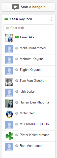
Figure 4: New chat bar
These are some of the changes we discussed but of course there are others we didn't mention like hangout window now allows us to select people from our list while still giving the option to add more people by typing their name or the circle which they belong to.

Figure 5: Hangout window
Google is really trying hard to succeed with Google+. There are currently 100+ million users. Do you think the history will repeat itself and Facebook will share the fate of Myspace? If you use Google+ will you still be using it after these changes? Please let us know.
I was hoping to read a bit about how google's changes relate to the problems that you had identified in your analysis of google plus at the start of the course...
ReplyDelete